A logo is the heart of branding, it should be representative of your business’ core mission, vision and values. That’s an important job for one image.
So, when you’re ready to have your logo designed, keep our 5 powerful tips for creating an effective logo in mind.
1. Keep it simple
The most memorable logos are the simplest. You can’t be everything to everyone, and your logo can’t express every minutia of your branding, so focus on the top priority. You don’t need to be too literal or linear, i.e. a real estate company including the image of a house, however, do focus on the simplest solution you provide to solving a problem and visualize it.
“Design is the silent ambassador
of your brand.”
(Paul Rand)
2. Pick fonts carefully
Let the tone of your business guide your font choices. If you’re a highly skilled professional in an industry where professionalism is emphasized, you could choose a serif font. On the opposite side of the spectrum if your business is lauded for creativity you could use a script or handwritten font to play on a more whimsical approach. When multiple fonts are needed choose complimentary fonts from different font families to balance each other out.
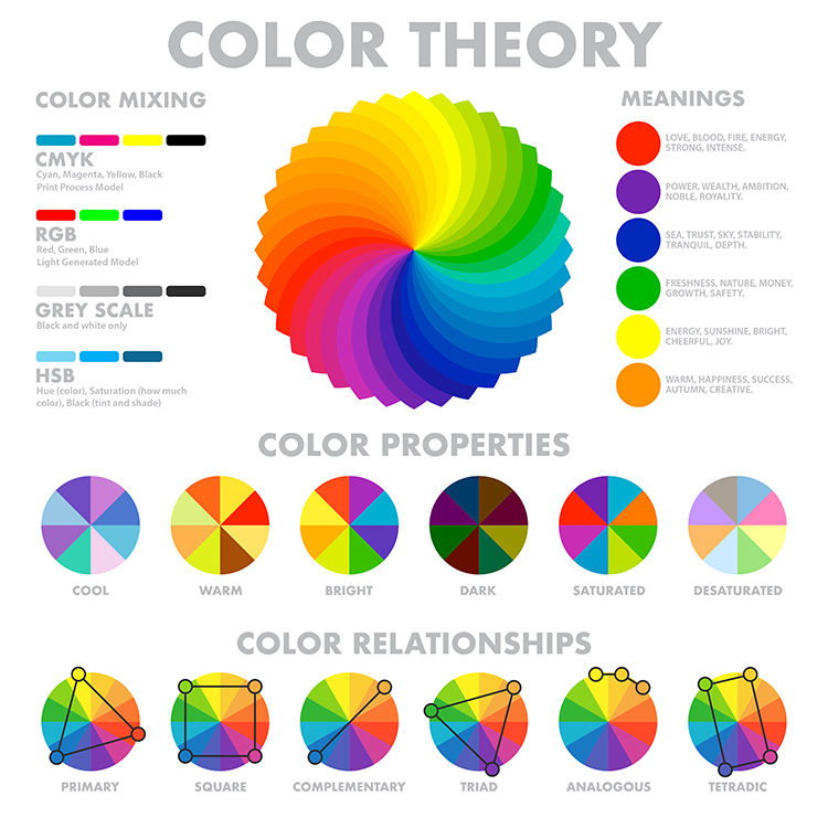
3. Use colors in a meaningful way
Colors can help make or break the meaning of your brand’s message. They will also be used in more than just your logo, you’ll likely include them in other materials you have made to promote your business. With that in mind, what feeling do you want your brand to evoke? Reliability? Trustworthiness? Fun? Then identify the color that most closely reflects that. You’ll also want to consider other companies in your industry, competitors and how you relate and can stand out.
4. Remember less is more
If your logo is going to be more than your name and you will include an icon of some sort, remember less is more. Refrain from having anything too intricate that will be confusing or water down the potential impact. Clean lines and minimal use of effects will help keep the message bold and on point.
5. Consider how your logo will scale and reverse
Your logo is likely to appear on various materials throughout its lifespan, from business cards to banners and websites to social media. In some cases, it will need to be in one color, possibly just greyscale or black and white and will need to be equally memorable. It will also be scaled differently, so how does it look small versus blown up? You should still be able to distinguish all of the linework on icons and read any text.
Let’s recap. An effective logo is simple, memorable and scalable. Navigate your color, font, and design choices around this three-pronged premise for a solid brand foundation.